Creative Typography Techniques for Eye-Catching Signs
Table Of Contents
Using Contrast to Enhance Visibility
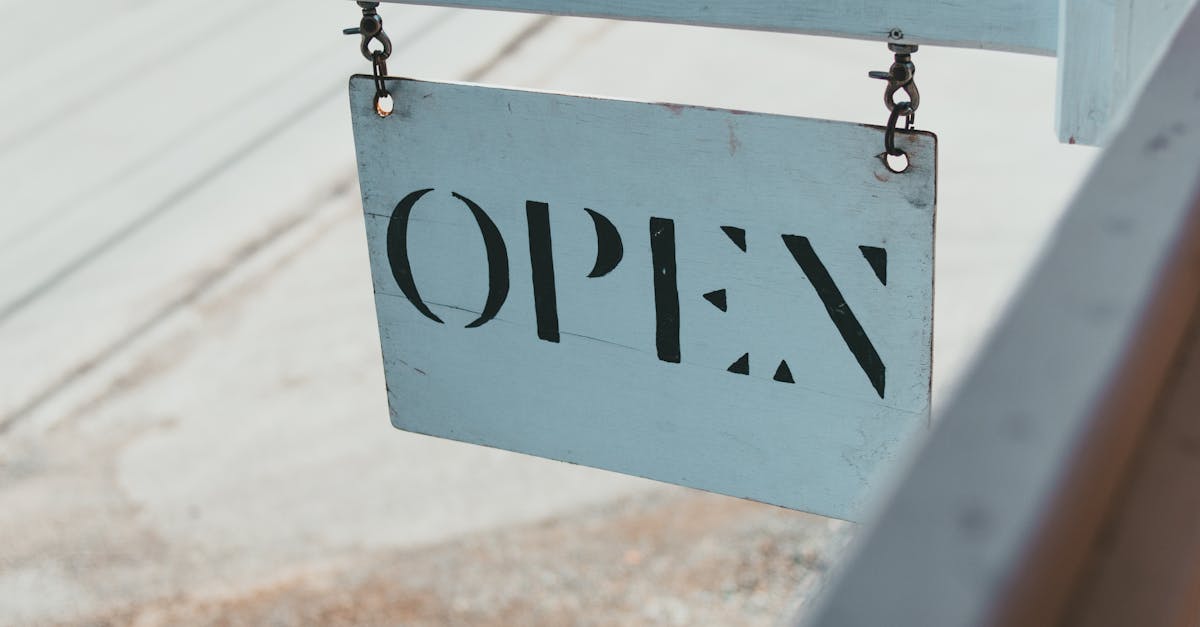
Contrasting elements play a crucial role in ensuring that signs grab attention and convey messages effectively. High contrast between text and background enhances readability, enabling viewers to process information quickly. Dark text against a light background or vice versa creates a striking visual that draws the eye. The use of contrasting colours can not only improve legibility but also evoke emotions and set the tone of the message being communicated.
Effective contrast goes beyond just colours. Variations in font weight, size, and style can also heighten visual interest and impact. Bold lettering on a softer background establishes prominence, while lighter weights can soften a design without losing clarity. By carefully considering these elements, designers can ensure that their signage stands out and remains easily accessible to all.
Effective Colour Combinations
The choice of colours significantly influences the effectiveness of signage. Pairing complementary colours can create a striking visual contrast that draws attention. For example, using a bold shade like orange against a deep blue background makes the text pop and ensures easy readability from a distance. It’s essential to consider the psychology of colours when selecting combinations. Warm colours can evoke feelings of excitement, while cooler tones often convey calmness.
Accessibility is another key factor in colour combinations. High contrast between text and background colours not only enhances visibility but also assists individuals with visual impairments. Black text on a yellow background is a classic example of effective pairing that meets these requirements. By considering both aesthetic appeal and legibility, the right colours can create an engaging sign that effectively communicates its intended message.
Custom Typography for a Unique Touch
Creating custom typography can significantly enhance the visual appeal of signs. By developing unique letterforms, designers can establish a brand's identity that distinguishes it from competitors. This distinctiveness resonates with audiences, making signs not only more memorable but also more engaging. Personalised typefaces can capture the essence of a business's ethos or the atmosphere of a location, fostering a deeper connection with viewers.
Incorporating handcrafted lettering into signage adds an extra layer of authenticity. Such typography often feels more organic and relatable compared to standard fonts. The nuances in hand-drawn characters can convey a sense of care and craftsmanship. This approach also offers versatility, allowing for customisation that aligns perfectly with the desired message and aesthetic, resulting in a powerful visual statement.
Benefits of Handcrafted Lettering
Handcrafted lettering brings a personal touch that digital fonts often lack. Each piece is unique because artisans infuse their individual style, creating designs that resonate on a deeper level with audiences. This distinctiveness can elevate a brand’s image, standing out in a sea of mass-produced signage. Customers are drawn to the authenticity and craftsmanship, making them more likely to engage with the message being communicated.
The tactile nature of handcrafted lettering creates a visual warmth that enhances the appeal of a sign. This type of typography can convey a sense of tradition and reliability, which is particularly important for businesses aiming to build a strong community presence. Additionally, the variability in design allows for creative expression that is tailored to a specific audience, ensuring that each sign feels relevant and inviting. Handcrafted techniques can also accommodate various materials, further enhancing the overall aesthetic and impact.
The Importance of Scale and Size
Scale and size play a crucial role in the effectiveness of any sign. Larger type can attract attention from a distance, making it essential for outdoor signage where visibility is key. Conversely, smaller typography works well indoors or in settings where patrons are closer to the sign. Understanding the environment and the intended audience informs the choice of scale, ensuring messages are seen and understood promptly.
In addition to visibility, the size of the lettering can influence the overall aesthetic of the sign. A well-balanced design incorporates varying sizes to create visual interest and hierarchy. Using larger font for critical information guides the viewer’s eye, while smaller text can then provide additional details. This thoughtful approach allows for an impactful communication strategy, enhancing the overall effectiveness of the signage.
Making Your Message Stand Out
The effectiveness of any sign relies heavily on its ability to grab attention quickly. Vivid colours paired with large, bold typography can significantly elevate a message’s visibility. Readers often skim content, making it essential for crucial information to be presented in a way that it immediately captures interest. Strategic placement of design elements, such as icons or images that complement the text, can also draw viewers in, encouraging them to engage with the message more deeply.
Optimal use of scale plays a pivotal role in how a sign is perceived from a distance. Larger fonts ensure readability from afar, while smaller details can offer more intricate information upon closer inspection. This dynamic interaction between different types of typography can create a hierarchy, guiding the viewer's eye effectively through the message. By balancing these elements thoughtfully, a sign can communicate its purpose more effectively, ensuring it resonates with its intended audience.
FAQS
What is the significance of using contrast in typography for signs?
Using contrast in typography enhances visibility, making the text easier to read from a distance. It helps draw attention to key messages by differing the colours, sizes, and styles of the text against the background.
How can I choose effective colour combinations for my sign?
Effective colour combinations typically involve pairing complementary colours that create visual interest while ensuring legibility. It's essential to consider the emotional effect of colours and how they align with your brand's message.
What are the benefits of using custom typography in sign design?
Custom typography gives your sign a unique touch, setting it apart from competitors. It allows for unique branding opportunities and can convey your brand's personality more effectively than standard fonts.
Why should I consider handcrafted lettering for my signs?
Handcrafted lettering adds a personal and artistic touch to your signs, making them more memorable and engaging. It often evokes a sense of authenticity and craftsmanship that can resonate well with your audience.
How does the scale and size of typography affect its effectiveness?
The scale and size of typography are crucial in ensuring that your message stands out. Larger typography can be easily seen from afar, while the right size can balance the overall design, making it visually appealing and effective for communication.
Related Links
The Importance of Font Consistency Across SignageMatching Typography Styles to Business Types
Custom Typography Solutions for Unique Business Branding
The Role of Typography in Establishing Brand Identity
Modern Typography Trends for Business Signage